There were 26 attempts to create the Logo for U.T.

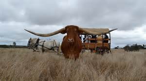
Ragan on his ranch with one of his Longhorns.

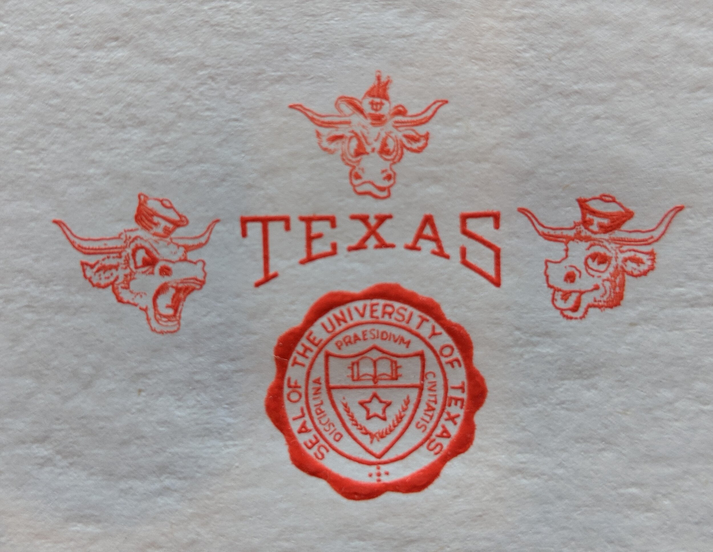
Choosing the “correct” Longhorn logo and the “correct” color for the Longhorn Nation took 75 years!!!
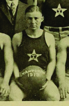
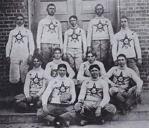
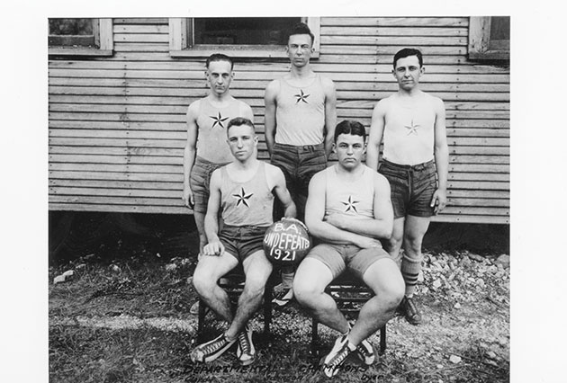
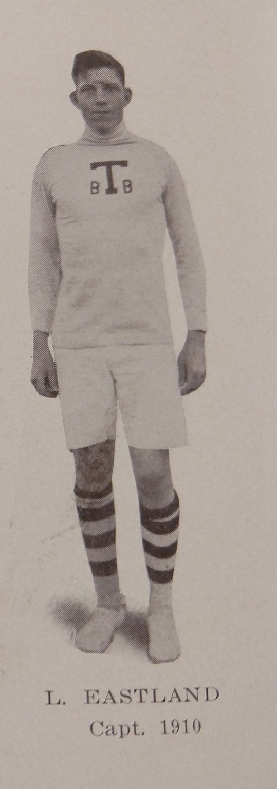
But there is still competition from other Logo designers. In the early 1900s, the University logo is a star, a star with the “T” in the middle, and a star with each arm containing one letter of the word “Texas.” Basketball team even tries to change from the star to a big “T” with a small “B” on both Sides.

1922 UT Band uses Longhorn Logo
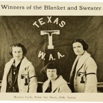
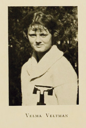
and the Women’s Athletic Association adopted the Longhorn Logo for their letter sweaters and Letter blankets with the Horns up.

1924 Baseball Logo – The image with the horns down was inspired by the Longhorn photo to the right.
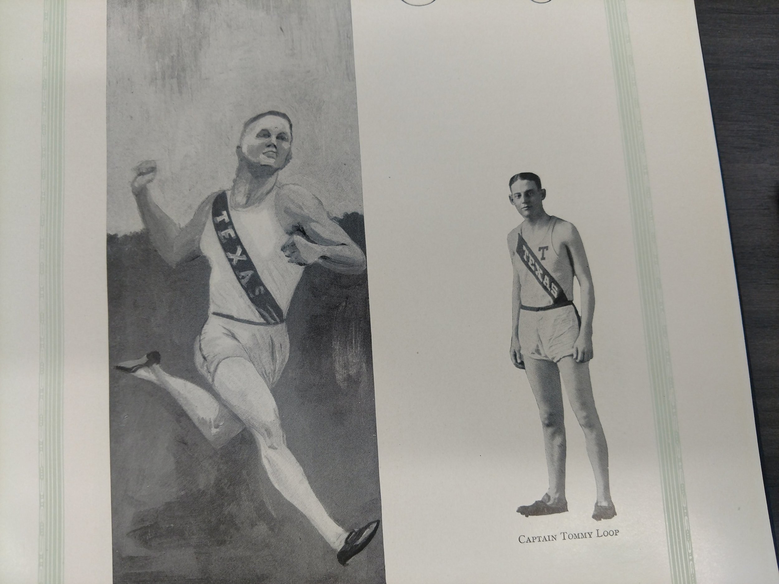
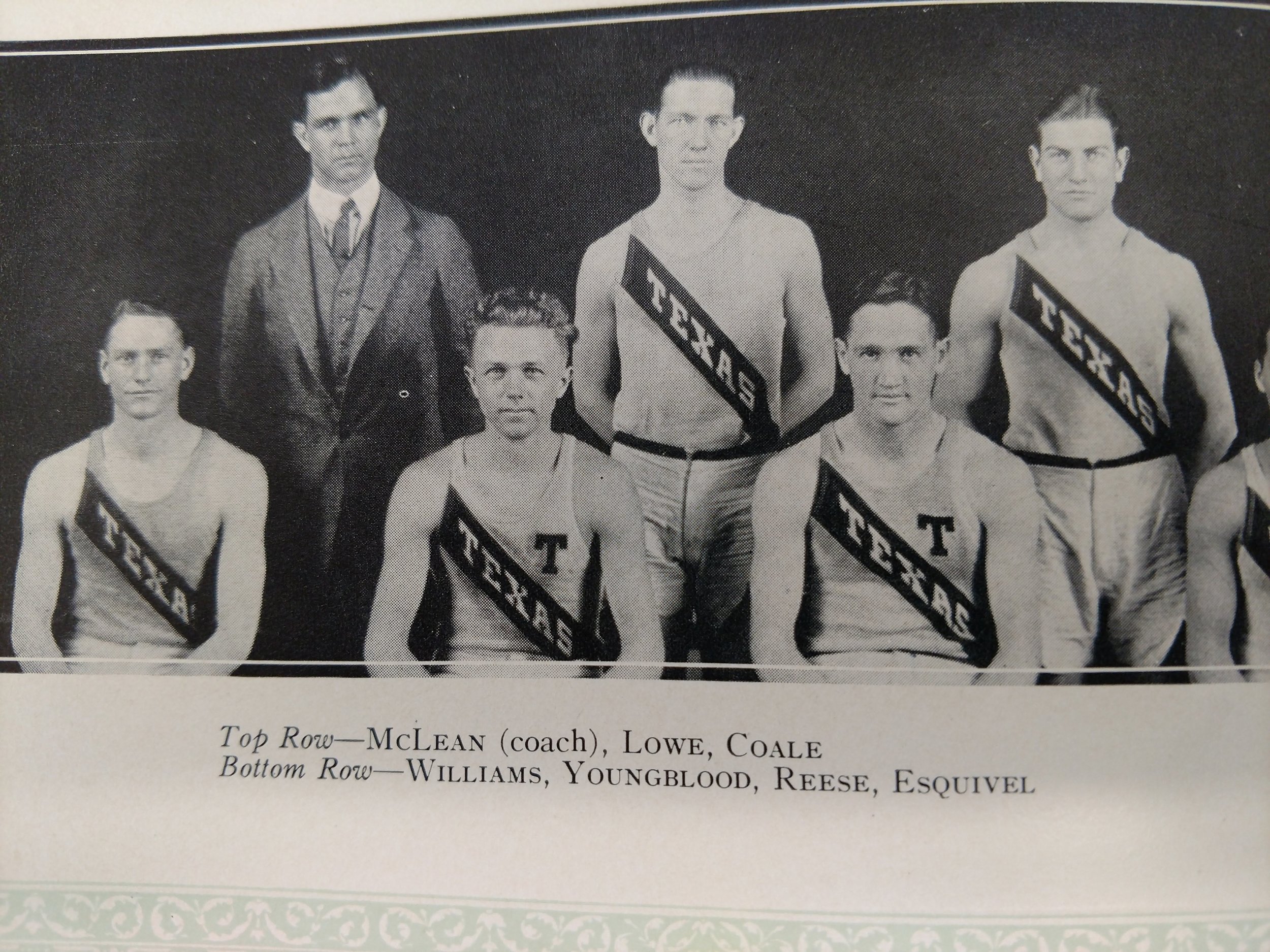
For part of the 1920’s the track team adopts a slanted “Texas” on their uniforms. The “T” on the uniforms stood for Captain of the team but no mention or depiction of Bevo.
However Lutcher Stark believed that the Longhorn was the UT mascot of the future and in 1920 he donated a plaque with a Longhorn in relief to honor UT alumni who died fighting in WWI.

WWI Memorial Plaque with Longhorn at top in circle

In 1924 Memorial Stadium adopted the Longhorns with horns up.
By 1924 many UT related institutions had accepted the Longhorn as the UT Logo, but the artist continued to struggle with the shape and form of the “horns.” Renditions included horns up, horns down, horns level, horns short, and horns long.
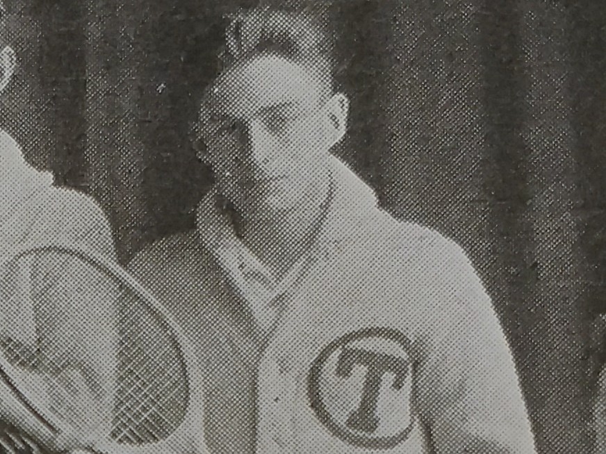
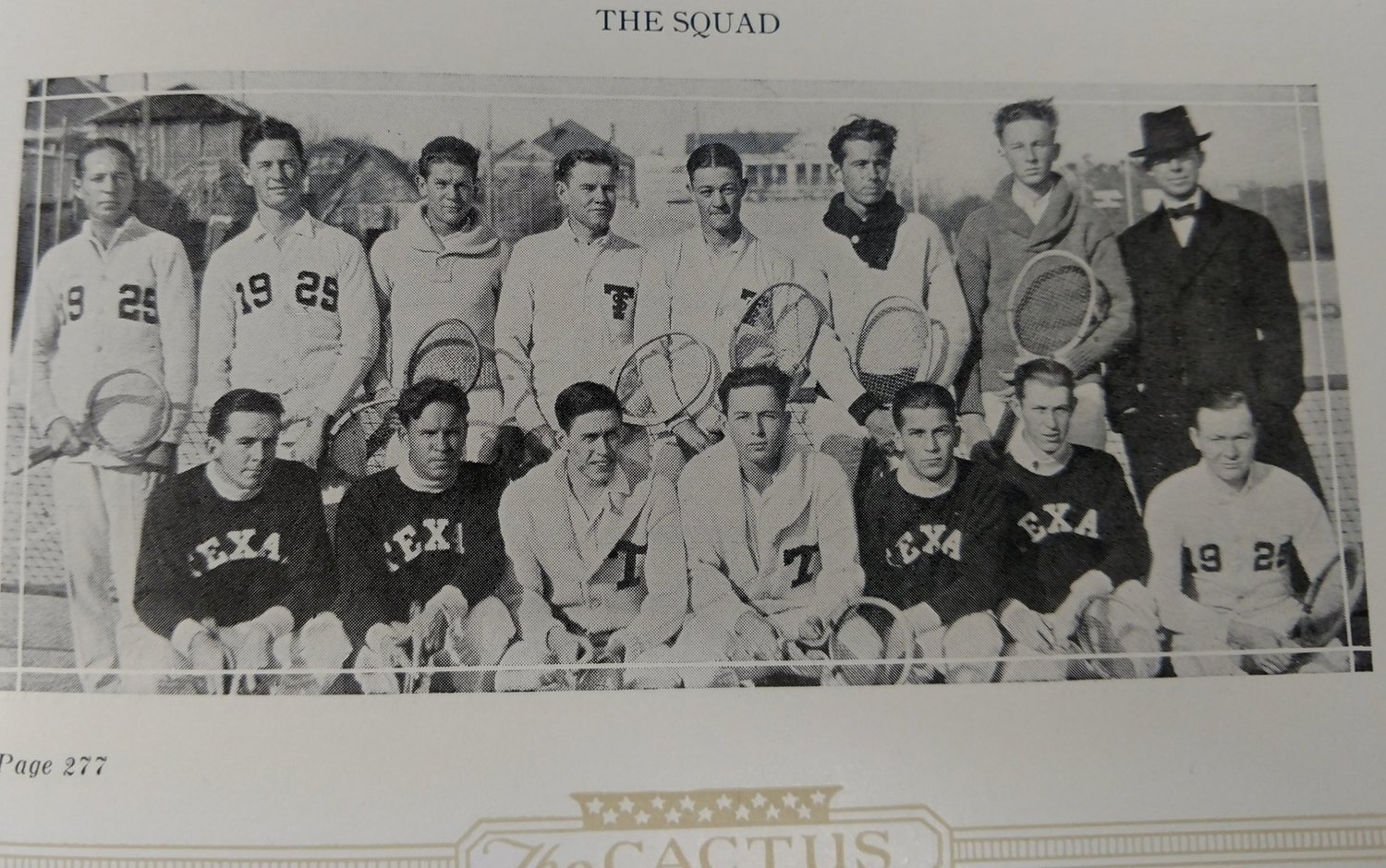
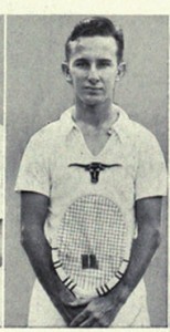
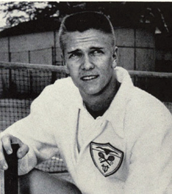
1925 Tennis Team below is really confused on the team logo . In fact, Tennis Coach Penick still refers to Texas as “THE VARSITY”.

1927 – UT stationary

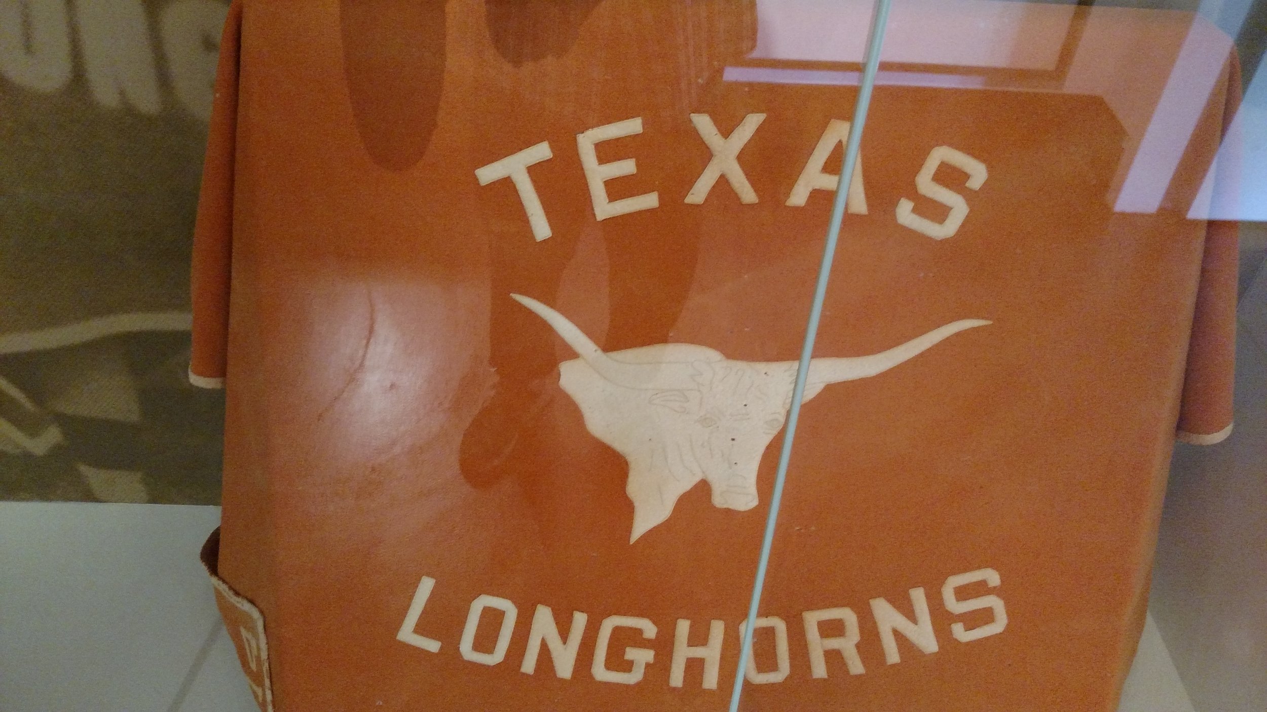
1928 Letter sweater
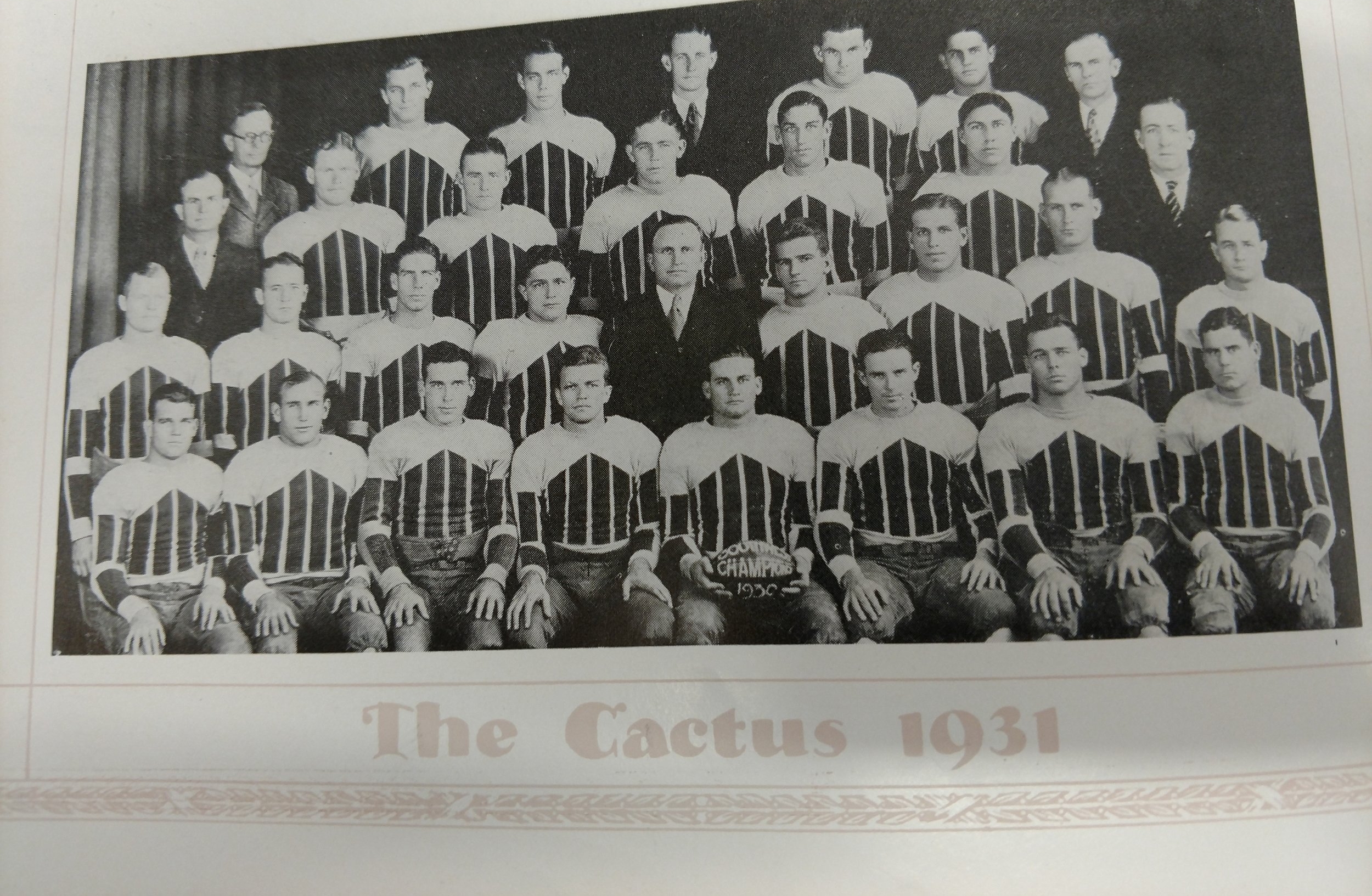
In the 30’s the football team wears ” designer” jersey’s with no mascot.
In 1936 the Texas Tennis team embraces Bevo on their uniforms with flat horns.
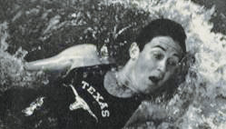
In 1939 the swim team incorporates the Bevo Logo on the swim suits and maintains the “flat” horn logo.

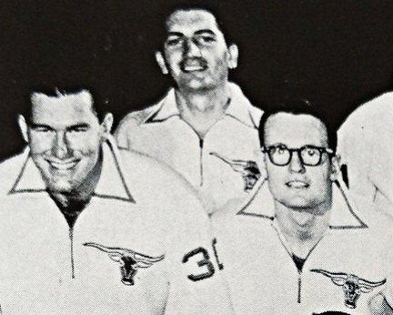
In 1941 a new horn depiction receives some notoriety.
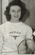
Alcalde says “aside from brief use by the tennis and swim teams, Longhorn logos were not found on all UT sports uniforms until 1961”, but some Horn sports teams in the 50’s used the Longhorn logo on their warm-ups.
In 1946 less than one percent of American homes had a television. Print and radio were the media formats covering football. In 1952 the NCAA decided to allow a few games on National T.V. The NCAA was concerned that television coverage would reduce attendance at games. So the NCAA approved one National match a week for eight weeks during the season and regional games the other two weeks.
By 1954 55% of homes had television, and coach Royal as the Head Coach of Mississippi State already understood the significance of T.V. to the sport of football. Before branding was a marketing term, Royal knew that brand building could also create football dynasties.
“less is more” was a brilliant marketing decision by Coach Royal.
Royal knew he needed to enhance the Longhorn image by using T.V. as the medium. Branding is everything when it comes to Sports, and Royal made his point by saying, “There are 29 peaks in Colorado taller than Pikes Peak,- name one”. His position was that even if the Longhorns were 29th in the nation, he wanted the Longhorn brand to supersede the brand recognition of the other 28 teams. Royal wanted the Longhorns to be the Pikes Peak of football. T.V. offered him that venue.
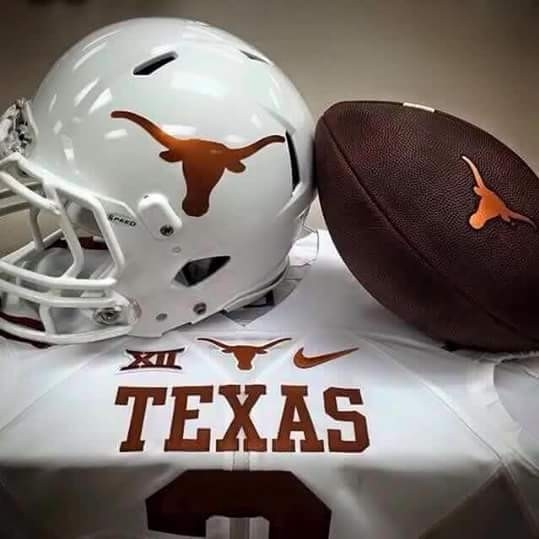
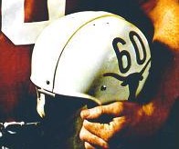
In 1961, Coach Royal asked Rooster Andrews to create a Longhorn sticker. One of Rooster’s images depicted a Longhorn head, and Royal knew that was the logo he wanted for the Longhorn helmet. Rooster’s vision would become the most iconic symbol of any University. It was the perfect Icon for branding the Horns on National television. U.T. is still earning significant dividends for a perfect call in marketing 101. As of 2017, U.T. ranks as the number 1 brand in royalties from licensed products.
By 1965 all prime time games were in color, and the T.V. viewers exploded. Royal built the Horns for this new medium. Since there were only three networks and a severely restricted T.V. game schedule, fans were lucky if they got two games a week in their market. Building a national reputation was simpler then. On T.V. during this period Texas won 88% of its games and looked good doing it. From 1961 through 1971, Texas was 16-5 on national T.V. Over 250 million people learned about the Longhorns over the next 20 years.
Alcalde points out The “sticker” was not complicated by a message that confused football fans with comic imagery. “the specific design of the logo … makes it so symbolically effective s …. clean and striking… without the anatomical details such as eyes and nostrils…. It communicates the strength of the longhorn without appearing ponderous… the logo is concise, memorable, and unmistakable. The simple, clear, pure, distinct, definite, and uncomplicated image of the burnt orange Longhorn in relief on the white helmet was immediately identifiable. The Alcalde makes the point that “Royal’s genius was in placing the logo in what was to become, as television coverage of college football grew, the prime piece of real estate in college athletics: the side of the football helmet.”

1967
1967 helmet
In order to make the logo even more prominent, in 1967 Royal moves the players number to the back of the helmet.

1969- 100th Anniversary of College Football and the Longhorn National Championship helmet

It still takes another 15 years before the university accepts Rooster Andrews logo. Even in 1963 and 1964, there were other Longhorn renditions, and there were other attempts to stylize the logo, but eventually, the DKR and Rooster Andrews logo is accepted.
After 75 plus years of the UT administration, artist fans struggling to capture the “right” logo to represent our great university, the process is finally completed.
History will show that there are at least 28 other contenders for the mascot and logo designs included the following:
-
Interlocking UT,
-
Only a star
-
T-in-a Star,
-
A star spelling out Texas,
-
A big “T” with small b’s on both sides
-
Slanted “Texas” (basketball)
-
Straight up and down “Texas” (baseball)
-
“T” in a circle,
-
Anatomically correct Longhorn,
-
Young Boys
-
Big ear Longhorn,
-
Longhorns,
-
Shorthorns,
-
Horns down,
-
Horns level,
-
Horns up,
-
Comical Horns,
-
Mean horns,
-
Happy horns,
-
Stylized horns,
-
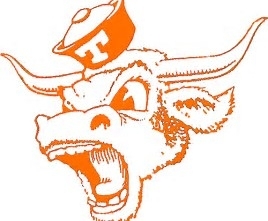
Cartoon Bevo both happy and angry
-
A three-dimensional image of a Longhorns upper torso
-
Designer uniforms
-
One horn up and one horn down – Basketball 1950’s
-
12″ band around the chest of the player
-
Blocked “T”
-
The “T” with a horn inset
-
Anarchy Logo